Here are two of my maps for Week 10. It's been a pretty frustrating week, but one thing that I did learn is if something doesn't seem to be working the way it should then start fresh. Save the layers and close Arcmap and change servers. It's as if Arcmap freezes up but you can't really tell except that things aren't working the way they are supposed to.
July 24, 2010
Week 10
Here are two of my maps for Week 10. It's been a pretty frustrating week, but one thing that I did learn is if something doesn't seem to be working the way it should then start fresh. Save the layers and close Arcmap and change servers. It's as if Arcmap freezes up but you can't really tell except that things aren't working the way they are supposed to.
July 8, 2010
This map shows the police stations of Washington, D.C. and the crimes committed in the area. With this map, you can see where the most crimes are committed and where there may be a need for more police stations. I recommend the two locations symobolized with a yellow star for new police stations. I chose these two locations because they seem to have a high crime rate and could use some more protection. The graph shows you each police station and the amount of crimes committed near each one.
June 18, 2010
Week 6 - Alachua County
June 13, 2010
The Role of GIS in Disaster Response
Today, Geographic Information Systems (GIS) plays an important role in disaster response and recovery. For example, it can be used to assess the extent of damage, provide infrastructure data to response teams, assist in the allocation of aid funds, and keep the community informed among many other uses.
GIS is used to assess the damage from a disaster by providing visual maps of the area of damage and the extent of the damage. In the Deep Horizon Oil Spill, GIS has been used to provide information to the public as well as recovery and aid units. Using GIS, we know the location of the pipe, the spread of the oil and the possible trajectory of the spill. This data has been integral in allowing communities along the coasts to prepare and be proactive in mitigating the damage as the spill progresses.
Response teams use infrastructure data to speed up their recovery efforts. It can provide them with information on damaged roadways, water infrastructure and electricity grids. With this information at hand they are able to make the best decisions for the speediest recovery. With infrastructure data, the Deep Horizon recovery has been able to find the best locations for ports, command centers and staging areas.
Part of disaster response and recovery includes allocating the aid funds and assessing those in most need of aid. GIS is able to provide visual information of the most damaged areas, and those most in need. Once the Deep Horizon well is shut down, assessment of the damage and hardest hit areas will be next in the recovery steps. The government and BP will have to make decisions on who, where and how the aid will be distributed.
Using GIS, the government and BP have been able to keep the world informed about the Deep Horizon oil spill. Maps have been used to display the movement of the oil, the extent of the shoreline damage, and damage to sensitive wildlife habitats.
June 9, 2010
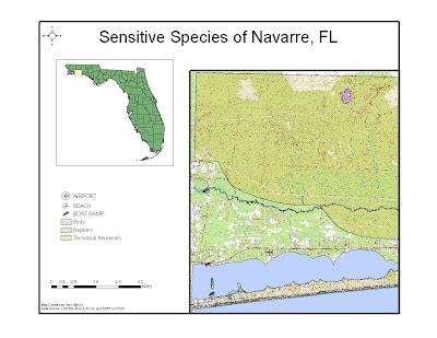
These are two ESI maps created for Navarre, FL used to aid in the cleanup of the Deep Horizon Oil spill in the Gulf of Mexico.
I was excited at first to do this project, but it proved to be the most challenging. I had trouble reprojecting the raster file and I'm not happy with the results of these maps. The raster file just doesn't look right and I'm not sure how to make it look any better.
June 2, 2010
Week 3 - Coastal Flooding from Hurricane Katrina
I didn't really have any trouble with this week's assignment. I used the map cache tool that was posted on the discussion board. What a lifesaver...or at least a frustration saver.
April 28, 2010
April 6, 2010
Week 11 - Labels, Spatial Analyst and 3D Analyst
March 22, 2010
Week 9 - Vector Analysis II
Question 1:
Which tool did you use? I used the intersect tool.
Was there any noticeable difference between its results and the results from the instructions? I ddin't notice any difference other than it took less steps to achieve the same results.
Question 2:
Which tool did you use here? I used the erase tool.
Why? The erase tool removes any areas that overlap and I wanted to make sure that the portions of the conservation areas were removed from the buffer zones so they would no longer be possibilities.
Question 3:
How many features are in this layer? 79
What is the area of the largest feature? 7,765,034.493 meters.
What is the area of the smallest feature? 748.114 meters.
March 17, 2010
Spring Break Fun!
March 2, 2010
Week 7 - Data Editing in ArcGIS
February 26, 2010
Week 6 - Georeferencing Rasters
I really enjoyed this lab. I think it's amazing the things we can do with technology. I didn't really have any problems, except for a couple times I couldn't get the rasters to show up with the road and building files. Sometimes I tend to move around too fast for my own good. I must remember to slow down a little.
On the first raster I had an RMS of 4.35183 and the second raster I had an RMS of 3.05197, and used the 2nd Order Polynomial.
February 21, 2010
Week 5 - GIS Data Search
February 9, 2010
Week 4 - Haiti Partcipation Post
I found these 4 maps on the New York Times Website. I found them fascinating! Although you can't see them on the pictures I posted, they did have legends and explanations on the website. I thought these were very informative and great at showing the damage that was done, the aftermath and the difficulties that rescue workers were having because of the closed roads. Here's the link to it, just in case you want to see the site with all of the legends.
February 7, 2010
Week 4 -- Projections
I found this map a little bit harder to grasp. I'm still unsure about the differences between the different projections. It took me a long time to decide the best way to display the information. My questions were: Should I add a data table at the bottom of the page with the different areas, or should I put it in the legend. I ended up deciding to just put the data in the legend because it looked simple and clean.
February 2, 2010
Module 3 - Map 3
Here are my three maps of Mexico. I didn't really have too much trouble with this Lab, except for trying to decide on color ramps. I did have a hard time figuring out how to change the Legend around for Map 2. My legend was showing the "Authority" and River ranking. I finally figured out that I have to change the style of each one separately.
January 27, 2010
Week 2 Lab
This is my map of the World Population. I chose the peach color ramp because I thought it would make a good contrast with the blue background and not look too busy...simple is better. I didn't really have any issues, except my own frustration with the slowness of the connection to the ArcGis. It looks like I will also be learning patience this year.
January 18, 2010
Module 1 - Deliverable 2 Youth Center Locations
Module 1 - Deliverable 1 San Diego Zoo
Well, I had some trouble figuring out how to get the jpeg from the H drive to this blog, but after reading some posts I figured it out. I downloaded Filezilla and was able to easily transfer the files.
I started to post a map, then decided I better read the Map rubric. It's a good thing, because I was all wrong. I fixed the map by using the layout view instead of the data view.